Watch my YouTube video for more information, and subscribe to my channel to be notified of new content.
Use different typefaces to make important information stand out and give your map texture. A few simple changes can make specific text “pop” while making it more visually interesting in a subtle way.
Example 2-1
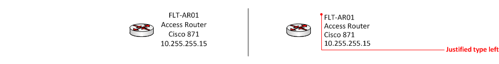
Here we start with the same visual. It’s what you get when you simply click on the text tool and start typing. This is where most people stop. All of the necessary info is there…right?
Example 2-2
I like to justify the type to the right or to the left unless the text is centered under the object/icon. In the example below, the text is to the right; I think it looks better visually to be “justified left” [Shift+Ctrl+L]
Example 2-3
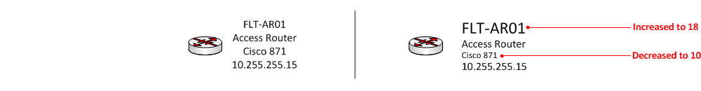
Here we make important info, like the router name, larger than the other text, and the router model smaller as it’s less important.
Example 2-4
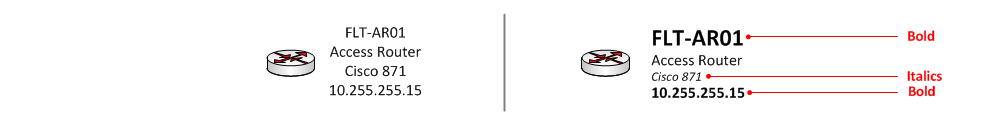
Now we’ll use bold to make the name pop even more, and italics to introduce a little bit of variance to the less important info.
Example 2-5
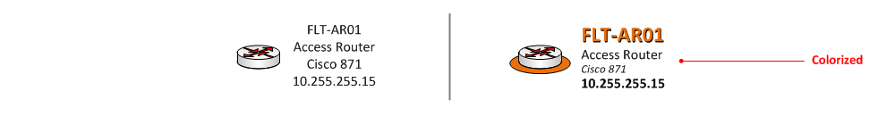
If those changes aren’t enough, you can add a splash of color. Be careful not to get too overzealous as we will be applying color to other parts of the diagram. We want to keep it simple, yet interesting. I usually reserve coloring text only when it is a focal point or main site, such as a data center.
Summary
It is easy to see that the text on the right is more visually appealing, and helps someone using it to see important information first, such as DNS name, IP address, and make/model.